UXisNext | Case Study
In this case study, I will briefly go over my first team project as a front-end developer for our website, UXisNext, giving information about UX design and the community surrounding it. Please view the website demo along with the case study!
Role: software developer
Members: 3
Languages: HTML/CSS
Framework/Toolkit: Bootstrap
Duration: 2 months

Overview
Similar to my individual front-end development project (coming soon!), I developed another website for my team, UXisNext, designed to explain the fundamentals of UX design. No audience was mentioned in the assignment, but the intent is to inform users on UX design and perhaps interest them in learning by attending upcoming events and so on.
Audience
There was no formal audience demographics that were mentioned, but the point was to inform users on information about UX design, upcoming events, and more. Moreover, present information in an easy to understand format for those who don’t know or understand what UX design is.

Team/Role
Initially, we were presented with 4 roles: QA tester, project coordinator, team lead, and software developer. I ultimately chose to take on the software developer role since coding became something I found really fun to do and even better to see my design come to life. Also, I wanted more of a challenge because QA tester and project coordinator seemed like easier but boring roles; I was itching to do some more coding!
At first, we did have 4 teammates, but one dropped the course midway, so we had to make some adjustments. Additionally, another member didn’t contribute at all. Moreover, this meant more work for the rest of us to do. Therefore, I adjusted by acting as the content coordinator by utilizing ChatGPT to create filler content and add UX-related information.
Constraints
I had some major few stressors during the project such as:
-
Time constraint
-
Some group mates were not as helpful or present for some duration.
-
Pressure trying to code as quickly as possible.
I enjoyed my role as a software developer, but I suppose the creation of the website mainly fell on me, so it was a bit of pressure knowing that the members were waiting for the site to be done so we could move onto the next step of adding content.
Overall, having additional help and not being the only one coding would’ve taken the heavy load off of my shoulders.
Process
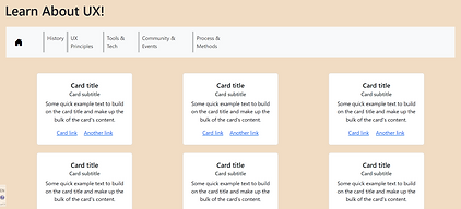
1. Before I could begin coding, we drafted up a wireframe of how the website should be structured throughout. It was quite helpful in the long run so everyone had an expectation of what everything should look like.
It was also a nice reference for me whenever I got stuck with the structuring; Using Bootstrap really helped speed the design process up too.
_edited.jpg)
3. After the first draft, the group liked the overall progress, so I tried to finish up the rest of the pages. It was important to me to get everything structured and responsive as soon as possible so we can add the informational material.
Everything for the project was done virtually, so I repeatedly sent updates to the project coordinator to ensure that we were on track as there was no formal timeline.
2. Overall, I created 6 HTML and 8 CSS pages to keep information spaced out and keep the designs organized.
With that being said, the design scheme we went for involved utilizing Google fonts’ Montserrat weighted from 300 to 800, gradients of lavender to pale yellow as complementary colors, and accents of dark purple.

4. As I kept moving forward, I made more adjustments to the layout (in this case, the UX Principles page) to try to fit the expectations though a specific wireframe wasn't created for the page.

5. As I kept moving along coding the other pages, more wireframes needed to be designed. Therefore, I designed 2 wireframes for the Tools and Tech and Process and Methods pages.

Process and Methods wireframes -- not pretty but effective
Tools and Tech wireframes


6. Towards the end, I made some final adjustments before the presentation. Given the opportunity, I went back and made layout adjustments and added better responsive measurements (to some extent).
Really, I wanted the final project to look nice and to showcase my current coding abilities.
Retrospective
Things I got better at:
-
Using columns and rows.
-
Integrating CSS and Bootstrap styles.
-
HTML/CSS coding
Things I could’ve been better at:
-
Fixing the responsive layout for the spacing between objects.
-
Keeping the code clean.
-
Utilizing more design choices/arrangement.
The project was really interesting since I feel as though it was a step up from a previous HTML/CSS project I did. I was hesitant to take on a big role of being the front-end developer but I'm glad that I did. The project came out nicer than I expected and wanted my hard work to show. Overall, it gave me the chance to better my understanding using Bootstrap’s columns and rows and integrate it with my prior CSS knowledge.
However, I was having a very tough time trying to integrate the selectors such as hover, visited, and so on so everything was coordinated and made sense, but I couldn’t figure out a solution in time. At the same time, looking back at my coding, it could’ve been cleaner such as utilizing classes more and not ID’s; same for structuring the parent and child strings.