CursorSwap | Case Study
Throughout the semester, I worked on a project creating a simplified tutorial, CursorSwap, explaining how to download then install .cur files to customize their cursors. In this case study, we will go over the entire process and the laws and principles used to create it. Please view the whole scope of the project such as the prototype, full project write-up of the definitions, and presentation slides!
Members: 2
Role: User Interface Designer
Tool: Figma
Deliverables: Final project write-up, PowerPoint presentation, and interactive prototype
Duration: 3 months
Overview
For our project, my partner Devin and I created a tutorial while utilizing various laws and effects such as Von Restorff Effect, Serial Position Effect, Fitts’s Law, Miller’s Law, Chunking, and much more.
We decided to make the tutorial simple by teaching users, regardless of computer literacy, how to download and install .cur files to change the appearance of their mouse and other icons on their computer.
Overall, the semester-long project was broken up into 3 phases: mini project 1, mini project 2, and the final project.


Problem
There wasn't a defined problem but the idea was to create an effective instructional guide for users to download then install .cur files to change the design of their mouse icon to their liking.
Audience
No specified audience, however it can be inferred that it’s for those who are interested in changing the cursor design for their mouse using a Windows-based computer.
Also, from the assignment and project’s structure, it is meant to be used by anyone regardless if they have computer experience or not.
Role
I was a co-designer alongside my partner, Devin. As it was a semester-long project, we divided up the work between the both of us. My contributions consisted of:
-
Writing down notes and feedback from the instructor and classmates on how to fix our errors.
-
Creating the frames, components, and prototyping functions in Figma; kept the work divided up rather equally since he was a bit better at creating pagination and other interactive functions, so I was able to learn some techniques from him.
-
Reporting the design principles and laws we used through both phases and how we implemented them into the modules.
Regarding other contributions, on my presentation days (Wednesdays) I was responsible for presenting deliverables such as updates we made to the design and layout of our modules, asking for feedback then implementing them based on what would work best.
It looks crazy, but there is a method to the madness


Constraints
I encountered a few constraints throughout the duration of the project that made the assignment challenging at times, for example:
-
I felt like everything went by quite fast for the process of getting mini project 1 done in about 2 weeks; sketching or making a brief draft of where everything should go and how we want it to look would’ve been nice but needed to finish the beginnings of the project rather quickly.
+Partner made a small one so luckily it gave us an idea of what the design layout, text, and visual elements could look like.
-
I received numerous amounts of feedback through presentations, but often found some information tough to implement while trying to be original and add our own flair.
-
I felt overwhelmed at times with the demands of the professor, practically second-guessing my decisions. Overall, it made me question myself a bit about the future–following the typical user schemas is beyond helpful but at what point can you step outside of the box without violating them or having the design look terrible?
Process
Drafting and brainstorming
1. Iterated with my partner to decide on what topic we should cover. It didn’t take long since he came up with something; it was an unfamiliar topic for me but easier to do with his expertise.
We didn’t have a lot of time to draft up a wireframe or mockup, however, Devin did come up with a brief outline that practically designed the module for us.


Prototyping
2. For my tasks, I created and designed the basic structure of the 21 main frames for the tutorial ranging from the homepage to lesson 2’s overview page -- simply, laying the foundation.
Additionally, I created a few component drafts such as the pagination functions and navigation bar.
Design-wise, I was going for a scheme that reflected similarly to a computer based on the topic and so the user can interpret what it is about even if they don’t know what a .cur file is.
Final prototype to show all of the current frames


Components

Formatting
3. Initially, we were having issues with the steps. In overview, wanting them to provide a sufficient amount of info yet not overwhelm the user’s cognitive load and comply with Miller's law.
Later on, we made changes to the formatting and wording. Devin placed the images and corresponding annotations to further explain the info needed to accomplish the task; moreover to comply with Multimedia Principle.


Feedback and iteration
4. Before we started the next phase (mini project 2), we went back and made changes suggested by our professor by fixing up the layout and correcting wording so it would be understandable and clear to the audience.
Most of our issues in feedback stemmed from the comprehension of the directions in the steps either being too vague or too specific. Moreover, having trouble accurately implementing principles and laws to the overall tutorial.
Before

After

Reasons for changes:
-
Changed the 'home' button to fit Von Restorff Effect, which states that when similar items are paired, the one that differs is most likely to be remembered. Therefore, to reduce confusion and maintain consistency, we made all of the buttons text and highlighted the current lesson tab instead.
-
Changed button from "Select . cur" to "Install . cur" for better understandability of what the lesson content entails.
-
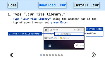
Highlighted the action verb and important info in the prompt to reiterate what needs to be done.
-
Circled and highlighted the search bar to point to where the user would look for the website. Plays in part to the Multimedia Principle which states that people learn or understand better from words and pictures integrated than with words alone.
Just to name a few!
Feedback and iteration cont.
5. For mini project 2, we presented our added designs and fixes from the previous mini project. Ultimately making changes such as adjusting the layout so everything would be consistent throughout.
As we worked on lesson 2, we added new principles and laws to our steps to help further enhance the learning experience to be as simplistic as possible.

Reasons for additional changes:
-
Added close up images of what's to be selected and the button to click to complete the action. The suggestion was brought about by my professor to help the user visualize what they need to do to complete the task. I found this to be a helpful way of portraying Signaling Principle, which states that people learn better from organizational cues of essential content.
-
Showed a wider shot of the context where the info is shown. This wasn't necessarily related to the principles or laws, but a suggestion by the professor since it added context of where these options were shown in the settings.
Presentation
6. Finally, considering that most of our fixes were done during mini-project 1 and 2, by the time the final project came around, I did a lot of fixes towards the project’s write up and explaining the definitions of all of the principles, effects, and laws in a concise manner and an explanation of how we utilized them.
On the other hand, Devin worked on creating the presentation and highlighting important aspects of the tutorial, “CursorSwap.” Our work was similar as it explained what principles and laws we used but not as in-depth as the write-up.


Retrospective
The project taught me a lot about the psychological principles and laws that affect the users both consciously and unconsciously. Overall, learning about these laws and principles and implementing them right away helped me understand their purposes. Working with my partner made the project easier to complete and even learned some Figma design tricks from him.
Moreover, learning about Fitts’s Law, Spatial Contiguity, Signaling Principle and other laws then integrating it into a project made me understand why designs are created the way that they are; it’s much more than just for aesthetic purposes.
