
TECHNICAL WRITING
As a technical communication major, my priority is to make sure information is conveyed to the appropriate audience and understood. I have experience in writing technical descriptions, reports, white papers, and memos. I have strong interests in technical editing, content creation, and organizing information based on optimal information architecture. Overall, I would love the opportunity to network with professionals in technical writing and develop my skills further.
Case Studies

For 3 months, I worked as a technical writer and analyst for Cornell University by revising 30+ knowledge base articles for various audiences. In my case study, I go over what the summer project goals were, examples of my editing process, reasoning, and more.
Additionally, I go over my executive summary and experience in the ADI program. Read more to learn about my time as a technical writer!

As the project lead for my senior capstone project, my team and I conducted a usability test on a popular bus route tracking app, TransLoc. Using many methods such as TAP, SUS, Likert scale, closed card sort, heuristic evaluation, and more, we were able to retrieve results and implement them into a redesign of app pages like the homepage and search page. After writing a 30-page detailed IMRaD report on our findings, I revised and edited the documentation for clarity.
Furthermore, explore my journey from my previous project, what changes I made in the revision, and how I grew from the experience.
Projects

Numbered List White Paper - Delta Lambda
Members: 2
Tool: Microsoft Word
Deliverables: White paper (numbered list), Memo
Duration: 1 1/2 weeks
Overview
In the span of a week and a half, I collaborated with my team to develop a white paper (numbered list) of the top 6 reasons why a business owner should switch from their current internet to Delta Lambda. The primary purpose of the paper was to take out other internet service providers and influence their customers to use our product instead. After writing the white paper, we both independently wrote memos describing the paper, the process, any ethical violations, and our evaluations of each other.
Audience
The audience we were provided with had the potential of being an executive, a middle manager, or an IT worker. My partner Mason and I decided that creating the product to be an internet service provider, or ISP, would be a great tie between the 3. We didn’t have much background knowledge of what goes into running a business but thought of some basic ideas such as sales, costs, security, high reputation, and more.
Process
First, we created a rough draft of the technical description then brought it in 2 drafts for peer review markup. We weren't too sure of what important information should be included but we tried to make it as realistic as possible.
My contributions to the white paper consisted of;
-
Developing the initial draft including the introduction, numbered list, and collaborating with my teammate about the audience, the purpose, and the title.
-
Creating the layout of the document including adding images and font styles.
-
Structuring and organizing the document’s information architecture to be digestible and quick to skim for the reader by adding and adjusting page breaks.
-
Writing contents for numbers 4 through 6 of the numbered list then compiling highlights from the main text and CTA into the summary.
To explain further, Mason and I contributed equally to the project by developing a realistic white paper that looks professional and highlights important information about the company. While developing my sections, I wanted to include information, in both images and text, that could resonate with the entire audience’s potential wants and needs. Lastly, I made sure to add a summary showcasing the same aforementioned aspects behind Delta Lambda then wrapped it up with a CTA, so when the reader does decide to use their services, they can.
Constraints
During the project, I encountered a few constraints during the process such as;
-
Being confused about what information would be useful and interesting for the potential customer to read.
-
Feeling constrained on the aesthetics as the document needed to be structured to fit native HTML and PDF formats.
Making the white paper for an audience that my partner and I don’t have personal or formal experience in was quite difficult to do. In this case, having SMEs would’ve been exceptionally helpful in addition to the little background knowledge that we had. To make up for the missing information, we tried to think of common features that most businesses would be worried about and common tropes used in advertising such as “increasing sales,” “reducing costs,” “improving security,” and so on.
Next, feeling constrained on the aesthetics of the paper was a bit concerning. Hypothetically, would pictures and text be enough to persuade the reader into purchasing Delta Lambda’s services? I don’t think so. If the document is going to have multiple versions, HTML, PDF, or hard copy, I would develop some sort of color scheme to fit the requirements while keeping the reader interested. We only had a week and a half for the project, so it would’ve been a bit much but in a situation like this, developing a style guide would be my go-to.
Finally, after the paper was completed I wrote a memo addressed to my professor explaining the process, any ethical violations we possibly encountered, and my evaluation of my partner Mason.
Summary
For our numbered list white paper, we developed a fictional company, Delta Lambda, a competitor in the internet service provider (ISP) industry. The audience is intended for executives, IT workers, and middle managers. To match the high professional theme, we transformed the white paper by highlighting aspects that we believed that business people would find important such as cybersecurity, uptime, costs, sales, and more.
Furthermore, I made contributions to the white paper by structuring the paper and including as much detail about the company and its services without going overboard. Another example of a contribution I made was structuring the document to flow nicely by utilizing page breaks to keep the content as close together as possible without breaking up the reader’s flow. Lastly, I added the summary to give another glance at the qualities Delta Lambda brings and use that opportunity to make a CTA.
At the end of the project, I presented my findings and the overall process to my professor in the form of a memo. In hindsight, the project was easier than I was expecting it to be. I now understand the brainstorming and insights that go into a white paper; this was surprisingly long for what was supposed to be quick content.

Technical Description - The MegaClip 3000
Members: 3
Tool: Microsoft Word
Duration: 1 week
Overview
For this assignment, my team and I constructed a brief technical description for the clip item we named, The MegaClip 3000. In this brief sample, I would like to show the drafts we went through before we came to our final decision for the product.
Process
First, we created a rough draft of the technical description then brought it in 2 drafts for peer review markup. We weren't too sure of what important information should be included but we tried to make it as realistic as possible.


Drafts with markups from peer review
After the peer review, we got some valuable feedback from both our peers and professor on what changes could be made such as;
-
Reduce the amount of white space.
-
The product specifications mentions the product color yet the pictures don’t show it.
-
Description could be longer and more detailed.
-
Clearly identify the audience in the description.
-
Include a bit more information on the overall capacity load of the product.
-
Include an explanation of the benefits that the product could bring to the user.
After receiving the feedback I took the initiative to restructure the document to include more details yet reiterate the provided information from the product specifications in the text.

My edit

Team member’s edit after mine
Another highlight of the revisions I made include making the technical description of the product more detailed and emphasizing why the product the user bought is worth it and what benefits it brings to their day-to-day lives. My classmates said that the description could’ve been longer, however, I ended up taking my professor’s advice about the product’s general audience. Do they really need a long, intricate description about a document clip or will a short to medium sized length description suffice?
After making some edits, my teammate, Miles, did a bit of fixing on the layout as well. We ended up picking it since he made better use of the white space! Overall, the document looks finished and more professional than it did before.
For our final deliverable for the assignment, I wrote a memo addressed to my professor describing the what the process was like, any breach of ethics, and my evaluation for both of my teammates.
Summary
In hindsight, the process was fairly simple to get started such as observing our object then hypothesizing how a user may find the product to be useful. The hardest part was trying to put all of our ideas together and produce a concise layout for the potential audience and what information should be included. I’m satisfied with the final technical description since it looks professional and would serve a brief summary of what the product is, its benefits, and why they should use it without telling them how to use it.

Heuristic Evaluation (Gerhardt-Powals)
Members: 4
Tool: Microsoft Word
Methodology: Heuristic evaluation (Gerhardt-Powals method), user persona, user story,
Deliverables: IMRaD report, memo
Duration: 1 week
Overview
In the span of a week, my team and I crafted a heuristic evaluation using Gerhardt-Powals’ principles to evaluate the website www.sebookstore.com for any usability errors that were present on the site (and are still present today, unfortunately). While performing the evaluation, we crafted a user persona, Brooke Turner, a 25-year-old college student who is studying HVAC, and how she would complete her goals of;
-
Gaining access to training resources
-
Getting the best study material that will allow her to ace her license exams for HVAC
-
Finding courses that are easy to follow

In addition to the persona, during the observation, each teammate performed an individual analysis of the site and rated various issues we discovered using severity codes ranging from cosmetic to major.
Constraints
There were a few constraints we ran into when we began doing the process and review notes our professor left for us. To summarize we had issues such as;
-
Confusion between the process with heuristic and cognitive walkthrough.
-
Final document errors (e.g. spelling errors, incorrect APA formatting)
-
Inconsistencies with the overall information regarding each teammate’s individual analysis.
-
Some information being miscategorized in either ‘results’ or ‘methods’, unspecified examples.
Benefits
There were benefits that came from the assignment such as;
-
Understood what a heuristic evaluation entailed and how Gerhardt-Powals’ principles guide researchers in checking the usability of a product over other methods.
-
Conducted thorough research to help fix a site and improve ease for the user.
To elaborate, the assignment was confusing and oftentimes I would get some methods such as cognitive walkthrough mixed up with the heuristic evaluation so having groupmates to bounce ideas off of and help with research was helpful. For example, there were some usability issues that I didn’t notice at first such as;
-
A lack of emergency exits and error preventions
-
Inconsistent wording and formatting on obscure pages for books and other products
Overall, with the extent of the assignment, having a team allowed us to check every inch of the site in hopes of finding errors that can be improved to help Brooke in her endeavors and other users. The usability test wasn’t as extensive but allowed me to place myself in a user’s shoes and figure out what are the typical functionalities of a user interface compared to other well-known websites or apps.

Cognitive Walkthrough
Members: 3
Tool: Microsoft Word
Methodology: Cognitive walkthrough, user persona
Deliverables: Cognitive walthrough report, memo
Duration: 1 week
Overview
For this project, our team of 3 created a cognitive walkthrough to evaluate how a user would interact with the website, divers-supply.com, to sign up for a scuba diving course.
Further, we organized the data using screenshots of our observations of the website and its in the perspective of our persona, Dylan, a 22-year-old student with an interest in scuba diving. The formal report demonstrates the purpose of the user visiting the site, what observations we noticed in helping the user reach their goal of signing up for a scuba diving course, and the conclusion we came to using the data we captured.
Process
Before starting the walkthrough, we crafted our persona to be a nice general fit for who the general audience of the website would be for--someone who is interested in scuba diving and the essentials that come along with it. The persona is very basic since the main focus of the report was on the steps needed to complete a goal on the website. That being said, we made a mini user story associated with Dylan describing his background, why he’s on the site, and what goal he is looking to accomplish.
Next, we created an action sequence or action tasks that the persona in perspective would need to accomplish to sign up for a scuba diving class. In hindsight, using a numbered list instead of bullet points would’ve been better to emphasize the step-by-step nature.

Further, we used screenshots and arrows to visually illustrate the steps Dylan would’ve taken to find the “Try Scuba” section then the enrollment section.

Finally, we noted any successes or failures we had during the cognitive walkthrough. This section was the most important since it highlights the ease or troubles one would have doing these simple tasks. A few issues we noticed during the walkthrough were;
-
Difficulty finding information on the website such as the “Scuba Lessons” option on one of the pages not having information on the enrollment process; something a user would expect to see.
-
Misleading or confusing options
-
Unhelpful pages by not redirecting the user to information that they’re looking for.
Constraints
With the project, there were some constraints I had with the cognitive walkthrough. I thought our group had a decent understanding of what the process was like but according to our grade, it didn’t seem like we did. Overall, some things could’ve been improved such as;
-
Better layout of the report
-
Better layout of the flow diagram
Another constraint was with time. Everything felt kind of rushed to understand and make an accurate report in the span of a week. I think that a few extra days would’ve helped us correct mistakes we made.
Summary
For our cognitive walkthrough, we created a brief persona named Dylan who is a 22-year-old student, looking for scuba diving lessons on the divers-supply.com website. Overall, the cognitive walkthrough was to explain the process the user would have to go through to sign up for a scuba diving lesson. We tried to be as detailed as possible while putting ourselves into the user’s shoes. With this process, we were able to make note of the successes and failures we had while completing the action sequence, moreover understanding the usability issues with the site.

Plain Language: KSU Grade Appeals Guidelines
Members: 1-4
Tool: Microsoft Word
Methodology: Plain language, usability testing (A/B testing)
Deliverables: Revised KSU grade appeal guidelines, usability test documentation, memo
Duration: 2-3 weeks
Overview
In this assignment, over the course of a few weeks, I made note of what issues were present in the student appeals document. Later on with a group, we rewrote the document to be clearer for both audiences, students and faculty members, and conducted a brief usability test (A/B testing) to verify how helpful or unhelpful the changes were. Lastly, I submitted a memo to the professor detailing the process to him as well.
Process
I first started by individually analyzing the document and making a list of what issues were present in reference to my plain language guidelines.

The next step was to individually analyze the document again and note where additional adjustments could be made. Using peer review through the discussion board, I received some feedback and gave some in return on what others thought could be changed.
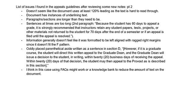
Finally, for the collaboration portion, my group and I made a compilation of all of the issues from the peer responses and our lists to focus on. Some important features included separating the audiences, adding headings/subheadings, fixing the document’s broken link, and so on. After planning out our changes, it was time to put them in action.
During this point in the process, contributions I made were;
-
Rewriting the student appeal process in sections B through E of the original document.
+ I followed the group’s previous edits and style of the new layout structure and broke up the appeal process for various audiences:
-
Undergraduate students
-
Graduate students
-
Faculty and staff
-
Editing granular details of the revised document such as font consistency, grammar, spelling, etc.
My edits in red for suggestions on the revision


For the rewrites, the content instructing the student on the steps needed to achieve a formal resolution seemed like it could’ve been rewritten better. Therefore, I put the process in an ordered list and rewrote the sentences to still contain the previous meanings while making the content understandable.
Finally, we conducted a brief usability test to see how helpful the updated version of the grades appeals guidelines is compared to KSU’s current version. We received some feedback on the structuring and understandability on the revision:
-
The information was clear and straightforward.
-
(From the structuring) the participant could understand what the document was about.
It would’ve been better if we had additional time to do a more comprehensive A/B test on the original document versus the revision, but we only had time to test 1 individual for about 30 minutes.
After everything was said and done, I created a brief memo addressed to my professor talking about what the assignment was like, what contributions I made, how I would rate my teammates and more.
Constraints
I had some general constraints while doing the assignment such as;
-
Trying to keep the tone serious while making the wording positive.
-
Editing for clarity while keeping the meaning.
Editing for plain language is simpler than writing from scratch, but I did have issues with the editing process such as maintaining consistency while following plain language guidelines and maintaining a level of understanding for the audience. In this regard, having my teammates there to bounce ideas off of and provide a different perspective was helpful.
Summary
In summary, creating the revision for KSU's grade appeals guidelines was a thorough task. I started off by making lists of issues with the document then developing solutions with my group. After creating the revised document, we conducted a brief A/B test using the original document and the revised document. For the final deliverable, I wrote a memo addressed to my professor detailing the overall group revision process.

UX Writing Microcopy Revision
Members: 2
Tool: Microsoft Word
Methodology: UX writing standards
Deliverables: Microcopy revision justifications memo
Duration: 1 week
Overview
In a week, my partner Makayla and I completed a revision of a poorly done user interface. We started by writing out the issues followed up with solutions, implementing them, then explaining why we made those decisions in a brief memo addressed to our professor. The purpose of the assignment was to redesign a microcopy to enhance a user’s experience.
Audience
The audience of the microcopy is aimed at people who need to use the settings to export files. The steps were originally very confusing and difficult to understand which hindered the user from completing the exporting process.
Process
As previously explained, we started off by highlighting the issues with the original microcopy and how it goes against UX writing’s standards. To simplify the revision process, we created a table showing the problems and solutions for the microcopy as shown below.

After identifying the pain points from the original copy, we made revisions to the copy such as improving the context of the buttons, steps, and layout for additional clarification.
Last but not least, we wrote a memo addressed to our professor explaining the changes we made to the copy and why those changes were necessary to improve the user experience. The memo can be found below.
Summary
For our UX writing assignment, my partner Makayla and I did a redesign of a microcopy interface for exporting files. The original copy had errors that impaired the user from having a decent experience. To start our process we made a table listing out the issues and possible solutions that could improve the experience. After brainstorming and comparing ideas, we implemented them in the revised copy. To wrap up the assignment, we wrote a memo addressing the issues with the original copy, why we fixed it and why those errors needed to be fixed.
Overall, the assignment was simple though made me overthink what would be considered confusing or essential to the user. The group effort was helpful in the sense that I missed some elements that she noticed, like the steps being rewritten better. This was an eye-opening experience to what UX writing for interfaces and copies entails and how there are many nuances that go into them.