Dream Destination Project | Case Study
With this case study, I created a website to show Mykonos, Greece's beauty and why it would be my dream destination vacation. While the design and coding didn't start great, I ended up revising the project and even added elements of JavaScript and animations throughout. Check out the updated site along with the images of the previous design below!
Role: Software developer, QA tester
Members: 1
Languages: HTML/CSS, JavaScript
Framework/Toolkit: Bootstrap
Duration: 2 weeks - 1 month
Overview
Using my fresh skills in HTML/CSS and Bootstrap, I designed a brief project on the location of where my dream vacation would be, Mykonos, Greece.
Additionally, provided information on the flora and fauna of the city, historical sites, and what I would do there using some research and ChatGPT to help fill in the content. The task appeared simple as far as getting started but ran into a few issues later on during development.
Audience
There was no suggested target audience but I imagine that a reader would want to be captivated by the pictures and learn more about the destination; moreover persuading them to visit there and understand why the city is
beautiful.
In short, persuade those who love to travel why Mykonos is a beautiful destination and why they should go there.
Role
My role in the project was rather extensive since I was solo. I acted as the software developer by coding the web pages and the QA tester by making sure the site functioned properly and was responsive. Overall, I took on many roles to make sure that the project would come out nicely.
Constraints
Some minor issues I ran into during the development was my understanding of how to get some elements to do as I want them to do when it came to positioning them.
Responsive design was rather new to me at that point so figuring out what code to use to get the pages to look how I envisioned them was difficult. On top of that, I learned about how to use Bootstrap in my design and was encouraged to use the tool in my project. It was frustrating having to butcher my previous work to fit Bootstrap code in, so it was confusing to say the least.
Yet, fiddling around with Bootstrap allowed me to make progress in understanding how simple and flexible it is as only light coding is needed to add cool functions.
Process
1. For good measures to eliminate me having to do it in the long run, I set up the amount of HTML and CSS pages that I wanted to use, something I remember my professor suggesting; It definitely sped the process up in the long run since I could keep track of what needed to be done next and keep an eye on my timeline.
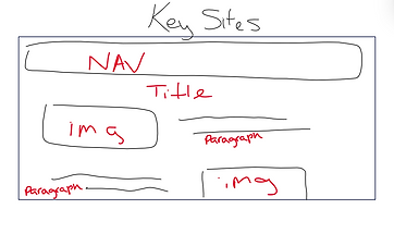
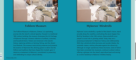
2. Next, I created brief wireframes of the homepage and 'Key Sites' pages to help guide me in the design process. I didn’t have a lot of time to design more for the other pages but the basic layout remained relevant throughout nonetheless.


3. Before putting any significant information, I developed a color scheme which was light teal and pinkish beige. The colors were a combination of preferences and what best matched the pictures and could convey a sense of “fun” and “colorful” like how one would typically view a vacation site.
That being said, overall, I created 5 HTML pages and 6 CSS pages so each the designs and layouts were organized. As this was my first solo front-end development project, I'm glad I organized the pages this way so making fixes would be easier.

4. Next, on the same stage of design, I began gathering my fonts from Google Fonts and made way on implementing the designs from the wireframes and to match the scheme.
5. By this stage, I began learning Bootstrap in class and had to implement the framework into my coding. I thought it would be easy, however it was not. It took a while to fully understand how to customize the functions to my liking. For example, taking the previous nav bar and integrating it with Bootstrap's nav bar function with responsive design and other elements.
I was relatively new to using columns and rows so I tried to utilize them on some pages however, I ran into an error on the “Key Sites” page with the footer; this is one big mistake that I want to prevent in the future. Subsequently, I believe this happened while trying to mix Bootstrap’s styling with CSS’.
Broken footer on the 'Key Sites' page

Broken column section on the 'History' page

6. Finally, to help with the content production, I did some light research and ChatGPT helped in this regard by generating relevant content about Mykonos and its notable landmarks.
Towards the end, I additionally attempted to add responsiveness to the site within CSS.

Retrospective
Pros:
-
Made a consistent theme that fits the premise of vacationing in Mykonos.
-
Utilized Bootstrap’s framework nicely.
Cons:
-
Time consumed with troubleshooting errors with Bootstrap and CSS
-
Should’ve added more designs to the website demo as it looks bland
In hindsight, I believe I developed a better understanding of how HTML/CSS work which makes the task of coding and organizing designs less daunting. I remember hearing how Figma is practically a visual version of HTML/CSS and now I can understand the programming side of the design process.
Another realization I had was how amazing Bootstrap is, but it does take some getting used to since it is easy to drop in and figuring out the nuances within the code is tough. Moreover, the process allowed me to configure Bootstrap to my liking.
Revisions
Updates
Languages: Added Javascript and CSS animations
Duration: 1 month
Generally for Audience and Role, everything remained the same. As for constraints, there weren't as many since I had more time to edit the site than the first time and had a better grasp on Bootstrap’s tools and whatnot.
Overview
In my capstone course, I was presented with the chance to revise my project. As part of my project inventory I took the opportunity to fix the errors that were previously mentioned. This time, I had a month to make the edits and the end result felt more finished than it did before. Furthermore, I will briefly go over what changes I made and how I made progress. I even added JavaScript functions and CSS animations to try out on the site.
Process
-
I started off the revision process with the homepage and developed a better layout to make the site appear more attractive. I had a bit of a color scheme before, but now the colors are more fitting for the tropical/vacation theme that I was going for (light peach, off-white, and hints of dark teal).


2. Added more content and rearranged them in a nice layout using Bootstrap’s columns and rows.
3. Fixed the glitches or code errors from “Key Sites” (page 3) so the footer is at the bottom of the page instead of midway.


4. By this time, I began utilizing ChatGPT more by inserting realistic content about Mykonos – My thought process was about how the site should be informational and feel aimed towards a general audience and not just myself (as it’s not a project requirement anymore).
ChatGPT was also very helpful whenever I encountered coding troubles.


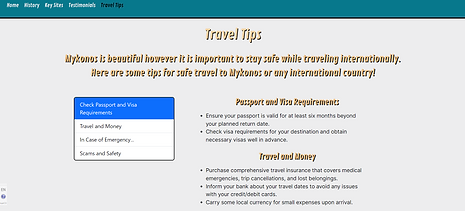
5. Changed the page content on “personal experience” to a page to view testimonials from “past vacationers” in the style of a forum to give the site a more realistic feel.
Then included a section for travel tips since the general information would be useful to any first-time international travelers.
Before

After
6. In the end, I made progress with editing the responsiveness of the website so the text and nav bar were consistent. I even added CSS animations and added a few JavaScript functions to improve the accessibility on the site by creating buttons to view information on the images of the homepage.
In the beginning, I had 6 CSS pages, now it’s increased to 9 pages just to keep the animations organized per necessary page.
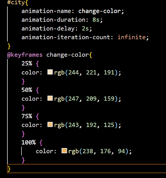
An animation for part of the header on the homepage to change colors.


Retrospective
There were some benefits that came about from the revisions such as:
-
Increased confidence in coding abilities and problem solving.
-
Refined skills in CSS animations and JavaScript.
-
Developed a more comprehensive color scheme/style guide for the site.
There were also some troubles that came from it such as:
-
Trouble with Bootstrap’s button states in tandem with CSS
-
Errors with responsive design as the windows shrink
Furthermore, the revision's end result looks better than the previous version and I’m glad I took the opportunity to redo the project. My objective behind this revision was to use the original case study paired with the updates I made to demonstrate how I recognized my errors and took the initiative to fix them. Using this time to test out CSS animations and JavaScript functions made the website feel ‘alive’.
However, I still had some issues with making the site responsive as the screen got smaller and with Bootstrap’s active state for links not working like the other states. Perhaps, this could be a sign to not rely on Bootstrap’s navigation bar as much in the future or find other resources. Even so, I’m happy with how much I did for the responsiveness of the site but I would like to learn more to make sites in the future more flexible such as moving images and text around like in Figma.