BiteExpress | Case Study
With this case study, I will explain my process on designing my prototype for the app, BiteExpress. Moreover, I will explain the up's and down's that I had while completing the final project. Feel free to view the interactive prototype alongside the case study!
Members: 1
Role: User Interface Designer
Tool: Figma
Duration: 3 weeks
Overview
In the project, I created a simplistic design of a food delivery app with features such as viewing the menu, browsing restaurants, checking account information and so on. Overall, though the project had easy tasks, I still ran into trouble when it came to using Figma features I'd never used before and limitations for completing the project to my liking. However, after the class ended, I went back and added some features such as a profile page, and more details to a restaurant page.
Problem
There wasn’t a defined problem per-say but the main point for the app was to create a new app design with better or more features than other current ones such as GrubHub, UberEats, etc.


Audience
Main audience was for the target demographic of users who use food delivery apps; another point being the students who attend my school, Kennesaw State University.
To keep the app realistic, I tried to use elements that are natural to the user such as a homepage to search for restaurants, ways to sign in or sign up, and so on; creating many sources of CTAs.
Role
For the duration of the project, I created 58+ components, styles, layouts, and so on for the allotted time of a little over 2 weeks. Throughout the project, I did acquire help from the professor to check to see that I properly created components so no future issues would arise.

Process
1. To start, I began by creating the landing page or homepage for the app. My initial thought was to keep it simple and have the necessary buttons (CTAs) visible such as "sign up" and "sign in."

Before

After

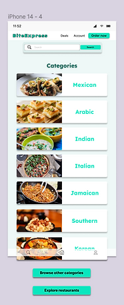
2. Secondly, I designed the category menu to contain various popular food genres and more CTA buttons. One element I tried to implement was to make the pictures big and enticing to customers; wanted them to be diverse which I feel some apps lack.

3. Thirdly, I hurried things up by working on the main contents of the app including a filter overlay, scrolling overlays of restaurants and food categories. I tried to make everything evenly spaced so the components could have room to "breathe."


4. Fourth, I made in-depth, profile pages for two restaurants. Again, wanting to make them as realistic as possible with delivery/pick-up options, comments, featured items, and more.

5. Fifth, I created the filters for main content. After the creation, I set them as overlays -- similar to how delivery apps how use them.
Before

After

6. Sixth, lastly before presenting my prototype, I created sign in and sign up menus based on which action the user decides to take. I tried to make it appear similar to the homepage and include ways to sign in for realism.

7. After seeing some of the presentations, I decided to go back and add a profile section to my prototype for added effect. I was amazed to see how people added a point system to their apps so I wanted to utilize it as well.

8. Lastly, (truly lastly) I added another overall / scrolling effect of a menu onto my previous restaurant profile, "Japan's Finest."


Towards the end, I went through a process of redlining the various elements -- the process allows coders to know the measurements for the items.

Constraints
Through the project, I faced many constraints such as:
-
Time limitations
-
Limited Figma skills
-
Other obligations
I wish I had a bit more time to fully put together my prototype. In total, I had 3 to 2 weeks or so to put together everything before presentation. During then, I had a Usability testing project, report, and other assignments that required my attention.
I would say that my Figma skills were sufficient but I lacked in the ability of trying to add an order system and order tracking function. I was surprised to see others had implemented it but confused me; that's something I would love to learn how to do.
Retrospective
In retrospective, I really love my first prototype and I'm proud of how well the process went into it. The experience was really fun despite the occasional stressful moments; I picture myself making more prototypes or mockups in the future.
On the other hand, fully planning out my creation with wireframes and having enough time to develop it would've been nice to have. Additionally, I think I could've done better with the designs of the filter overlays as I was having trouble trying to make use of the empty space but have it look clean.
When I had the chance, after the class ended, I went back and added some features such as developing the profile for the restaurant "Japan's Finest," added sign in and sign up frames, and a profile for an account.
